Naturally, if you work as a full time barista, sooner or later you will begin to get tired of simply pulling a shot, frothing milk and pouring it into the cup. It all starts with a simple fluke – an unsteady hand accidentally creating a squiggly white frothy abstract pattern, followed by intrigue and curiosity as you try again to recreate what you have just done but to no avail, ending with going back to not giving a damn. A fluke is a fluke and it feels great to see a pattern pop up once in a while, you get a great sense of satisfaction every time you succeed and it makes day to day barista work that much more enjoyable.
However over time, as your skills improve and your hands become rock steady, you find your flukes happening more often. This will no doubt boost the ego and encourage the barista to pursue various art styles. All of a sudden you are scrounging through youtube and instagram videos trying to find out how to pour that rosetta, tulip or whatever catches your eye. You become lost in the idea that you could also create these patterns, and as soon as you step into work the next day you buckle down and start getting creative.
Latte art used to be like that for me; I focused very hard on trying to get the pattern to form at the end of my pours. However, there was one critical mistake I made throughout my latte art obssession – I lost my ability to make good tasting coffee.
Only in the last year or so did I truly understand how and when latte art should be applied to best effect. It’s not always about the prettiest looking pattern on top of your drink, the taste is paramount and if art needs to be sacrificed in order to achieve it, then one must put aside their creative pride and deal with it.
Here’s an example of a very early latte art I did:
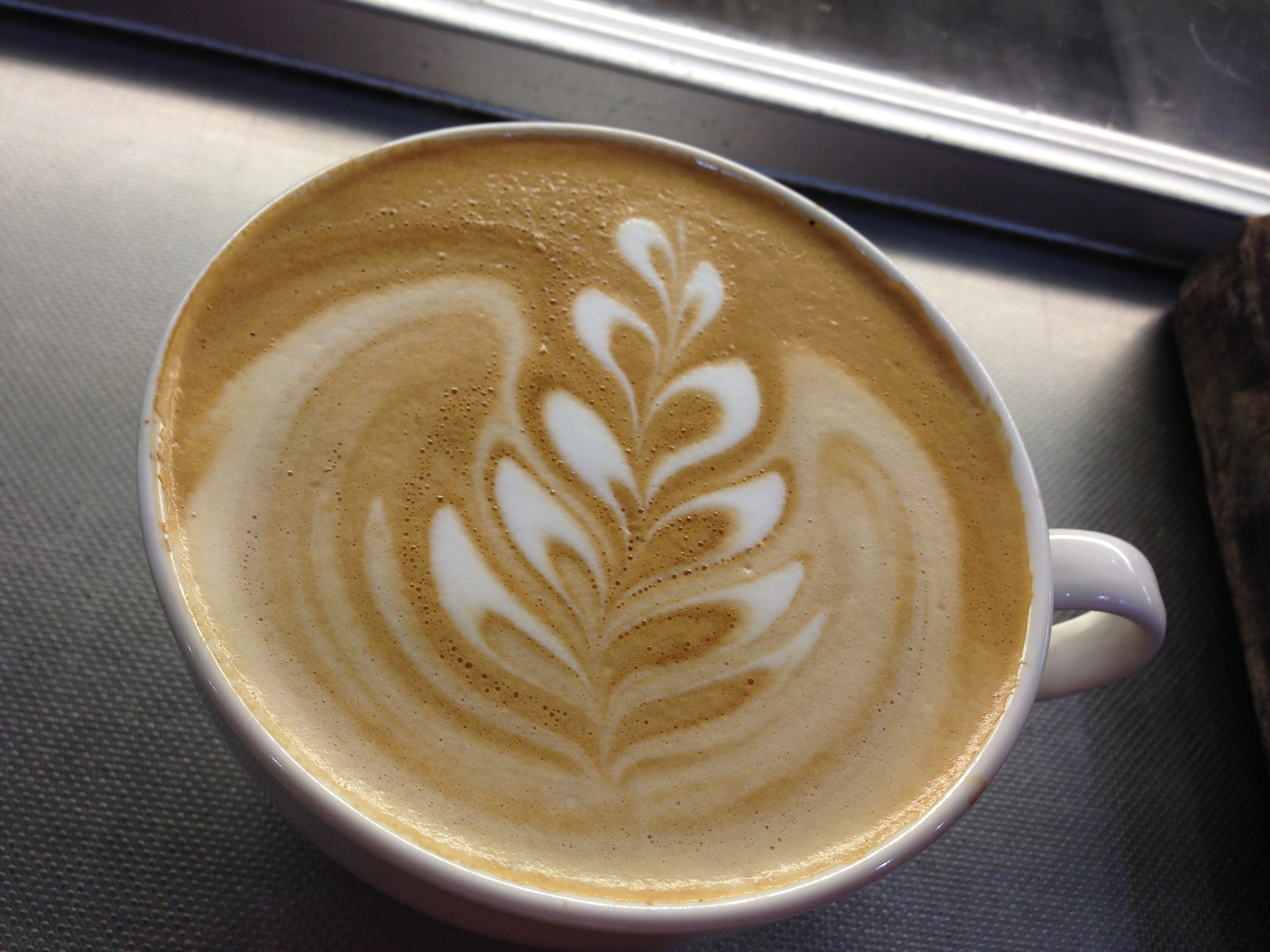
a Rosetta pour in my latte art fanatic days
Wow, that’s a sweet pour! I was pretty ecstatic when poured that. But looking back at this picture, It’s no good and if I were to pour something like that today, I would remake it immediately.
The main focus is on the taste of the coffee, which is defined by the brown coloured crema on top of your cup. If that rich brown colour is dulled by the milk, a lot of that coffee taste will be gone.
Here’s a pour I did recently:

flat white with a tulip design
Please excuse the orientation of the photo, it is unedited straight from my phone. The point I’m trying to show is that, while there is indeed latte art in the cup, It is surrounded by nice, rich brown crema. Your first sip on this flat white will have the full flavour of the coffee, and minimal (depending on how big you sip) milk taste.
When you go to a coffee shop, order a flat white and see how the barista makes it. If the surface has a rich brown colour, especially around the outer edge of the cup, and especially where you will be sipping from the cup, it means he knows what he’s doing.
It took me a while before I realised this, and when I did I started to feel really bad about serving all those latte art obsession driven cups to my customers.
Latte art should only be a complement to a drink, it should not interfere with the flavour of the coffee crema. As a barista, the goal is to provide customers with the best tasting cup of coffee, not the best looking cup of coffee.
With that in mind, as a customer, you can now confidently walk into any cafe and judge a good cup of coffee. After all you need to get your money’s worth.
As a barista, you need to understand when its appropriate to draw and when you should just focus on keeping things simple. When things get busy, unless you are a very skilled barista, it will be hard to deliver consistent latte art for every single cup. So here are a few simple and general rules I like to stick to when such things happen:
- For cappuccinos, I tend to avoid drawing latte art, since caps are meant to be frothy and it gets harder to draw art the frothier the milk is. If I really wanted to draw something, a heart pattern would suffice.
- For lattes, keep it simple as well due to the amount of froth. A heart or a simple rosetta is ok
- For flat whites, you have more lee way to be creative; anything goes really. But always remember to retain the brown crema around the outer rim of the cup at all times.
- Any other non standard drinks that contain coffee is the same. For really small drinks like piccolo lattes or macchiatos, it really depends on your skill level. If you are not 100% confident your art will appear, don’t risk it.
So there you go, an insight into what I think about latte art. By all means don’t stop being creative, just remember that the taste should be top priority.

Never realized this!! Thanks and good luck with your ‘taste’ful art!! (I think the 2nd one looks really good as well!)
LikeLike